7.1 Making graphics
In the previous session, you learned how you can systematically explore your data and which questions to ask in order to determine the best visualizations for your data. In this session, you will learn about the individual charts and plots and how to make them.
Go through the following RStudio Primers:
Assignment
Download and read the verbrechen data from our Github page, or read it directly using this url: https://raw.githubusercontent.com/cdsbasel/rtraining/main/data/verbrechen.csv
Look at the data using the functions that you have learned in the previous sessions to get a general idea of the variables. You can use e.g.
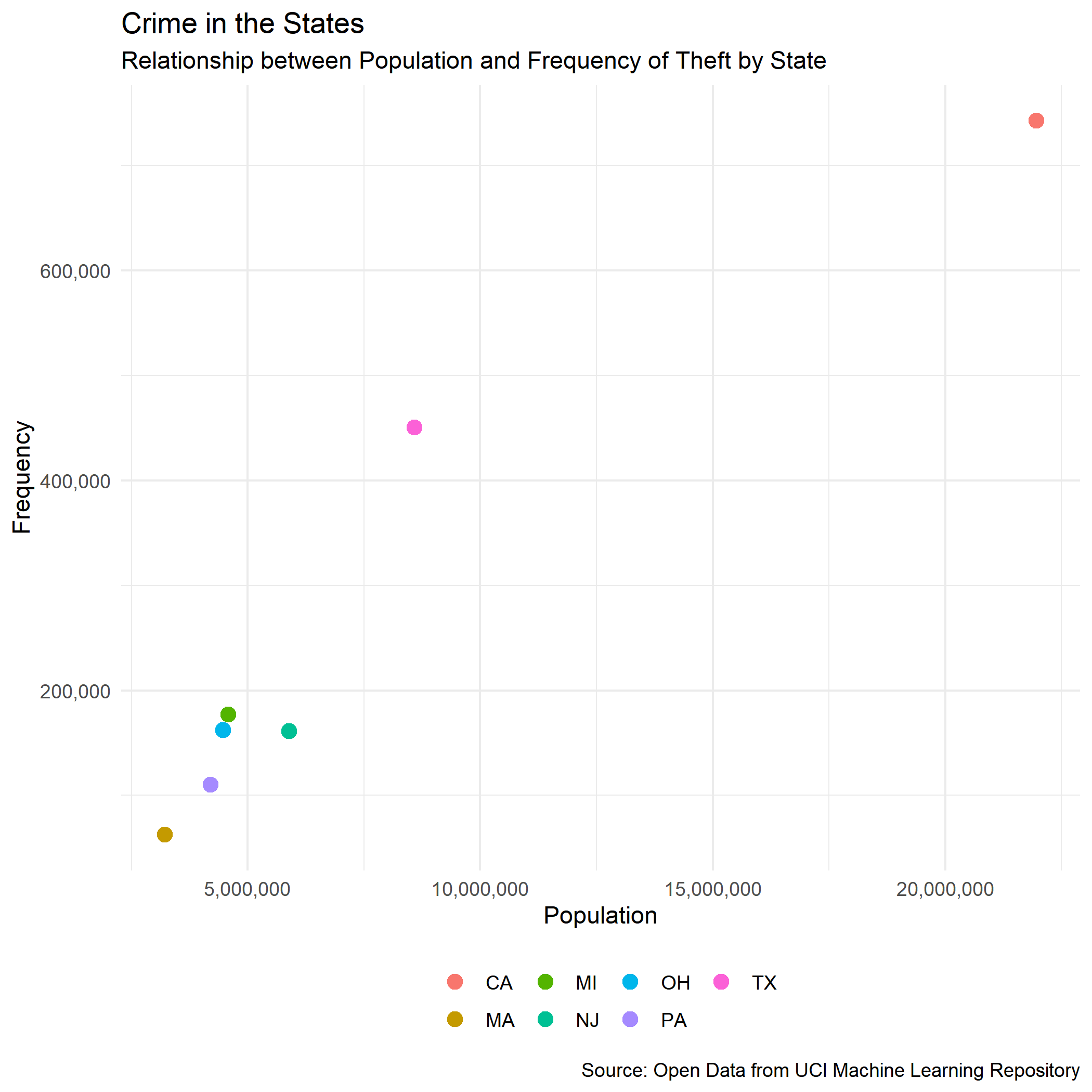
group_by(), summarize() and filter(). Some ideas for questions are: What is the minimum, mean and maximum number ofverbrechenby state? What type ofverbrechenis the most common type?Make a Scatterplot between
bevoelkerungand a type of crime of your choice. Adjust the colour or shape of the dots to show the different states or counties. You will have to use the functions mentioned above to first manipulate your data.
Tip 1: To show the thousand separators in the axis labels, add scale_y_continuous(labels = comma) + scale_x_continuous(labels = comma). For the comma label, you will first need to install the package scales.
Here is an example of a scatterplot:
Tip 2: Of course, there is a ggplot2 cheatsheet for Data Visualization as well. 😃